As a capacitor of mental energy, I seem to be able to store about fifteen days' discharge at my peak rate. I've felt, these past few days, the winding-down of my Atari project coming-on, and this evening, as I began looking-over the lines of code in my editor, I felt the weight of my fuel gauge's needle come to rest against its housing beneath a dimly-lit E. Juice exhausted. Time to rest.
It could be months before I write another line of 6502 code. That's the way I operate. My appetite for understanding is ravenous, my compulsion to implement is overwhelming, but both are rapidly exhausted, and my compass now will spin and spin having arrived at that inevitable arctic nexus of project limbo. My brain is a limp organ. It slumps and wheezes.
I now look back at the past two weeks and ask, what have I gained? Well, in the concrete, I've only gained a functional-but-incomplete start to a word processor implementing proportional fonts on the Atari 800-series; in the abstract, I've gained knowledge on the operation of macro assemblers and early microcomputer operating systems, and have developed skills and techniques in implementing fast screen-drawing routines in MOS 6502 assembly language. I've also gained first-hand understanding of what can and can't be done with limited resources, and the dually encouraging and discouraging knowledge that the difference between code that gets the job done, and code that gets the job done, buys you a couple beers, and drives you home afterward is only about 8-24 hours of concentration and meditation.

9BG:STA, TAY, INC alive?
Good lord in heaven. I've been eating, (not)sleeping, and breathing 6502 code for the past few days, and you know what? I still suck at it.
I gave up on WUDSN/Eclipse. Way too fat for my taste. Instead, I grabbed a copy of ConTEXT, along with the 6502 ASM highlighter that Aaron Curtis provided, and I wrote a couple batch files for launching ATasm and an emulator. Where Eclipse was a 60MB download, ConTEXT was... under 2MB, I think. And it launches in about 1 second. That seems slightly more reasonable to me when I'm working on code for a 30-year-old computer with a few dozen kilobytes of memory. Oh, wait; the term is kibibytes these days, isn't it?Silly me.
So how's the program coming? Gah! Y'know, there are just some things that are hard to do fast when you've only got a million or two CPU cycles per second. The good news is that you can write a nice, tight loop that will insert characters and redimension a text buffer at about 44,000 bytes/sec. The bad news is that you can only write a nice, tight loop that will blit 16x8 pixel bitmaps to the screen at about 1000 characters per second.
Oh, shit!
As I was writing that sentence, I just thought of a great way to speed things up. Man, I love when that happens. I already doubled the speed of character drawing over the past couple days, but it's got to be faster. It might just get faster tonight. Hoorah.
- - -
If my memory serves me well (that's a laugh), I've owned (or at least controlled) the domain Apocalyptek.com for about ten years now. I'm considering letting it go this month. When I was 19 and I came up with the Apocalyptek name, I thought it was cool as all heck. Now, after years of trying to inject meaning into an essentially meaningless, cool-sounding name (meaningless? Never! Apocalyp-, apokalypsis: revelation | Tek-, techne: art,skill || the art that reveals, or of revealing; apocalyptek), I think I've just stopped caring. The site's never brought me any traffic, not that I had great hopes for it doing so, but if you're going to hang on to a vanity domain, it may as well be something that you actually feel is representative of you, or what you want your perceived identity to be, or ... something like that. Apocalyptek is, at this stage, a lousy title for a graphic novel project that I'll probably never get off the ground, and the name of a website which gets flagged by Google every six months as a source of malicious code. It's the return-address domain of a few hundred spam e-mails every month, and a perpetual pain in my ass. The sad thing is, the only reason I'm considering keeping it at this point is because I use my @apocalyptek.com email address as my primary.
- - -
Somebody was going to throw away a perfectly good ten-year-old.
TV. It was a ten-year-old TV. A nice one. An FD Trinitron. It's mine now, because unlike the rest of you fucking heathens, I have a great love of tube televisions. Yeah, yeah -- you can go to Best Buy and get your flashy new flat-screen garbage and impress your friends by watching the Ultimate Matrix Collection on Blu-Ray or something, while I'll be sitting here, bathing in the warm, phosphorescent, 15Khz glow of a real TV, confident in my belief that 480 lines...
...are enough.
9B9: Proportionally Awesome
I astound myself with my ability to invest twelve hours of labor per day in projects which I will never be paid for, whilst paying projects lay idle and whimpering amid stacks of mental detritus.
 Picking-up where the meat of 9AJ left off, the screen-dump to the right is the first flickering of life from my most recent (entirely unnecessary) foray into Atari software development. I downloaded Eclipse the other night, so I could install the WUDSN IDE, which is very nice and gives syntax highlighting and easy integration to ATasm. I do have to make an effort not to be bothered by the fact that Eclipse (which, for my purposes, is really just a gussied-up text editor) reserves over 120MB of virtual memory on top of around 30MB of physical memory, and results in a lot of disk-thrashing when switching between apps, but I shouldn't complain because it beats the pants off of my previous Atari development workflow, which went like this:
Anyway, as you can see, a small proportional font even on the Atari's meager 320-pixel-wide display can yield almost 80 characters per line. This is actually more than I was shooting for. I intentionally designed my character set to have an average glyph width of around five pixels with the hopes that I'd be getting ~60 characters per line, but I misjudged the abundance of spaces, Is, and punctuation in the average line of text. If I'd just copied Two Bit Gothic..., the situation would be even worse, probably something on the order of 100 characters per line. Too much.
I'm actually considering going a different route and using the Atari's "narrow playfield" mode, in which the display list processor only draws 256 pixels per line. One reason I'm considering this (less pixels? Sacrilege! I know...) is because it will skinny-up the display and get me closer to 60 characters -- but if all I cared about was the number of characters per line, I'd just redesign my font. The other reason I'm considering going the narrow playfield route is because I could do all my cursor positioning in 8-bits, and remove an awful lot of irritating 16-bit math from the code. This would also speed things up, and that's a major factor, since, as it stands, the program is pretty slow at drawing a full screen of text. Remember, I'm not using any of the machine's character-mode hardware, so it's raw CPU that's putting the text on the screen.
Anyway, it's barely a working program right now. There will likely be significant back-end changes before it's done -- and I'm probably going to find out that somebody else already wrote a really fast text editor for the Atari with proportional fonts in a couple of days, which will cause me to lose all interest in working on it and it'll never get done at all.
...
 Another thing I mentioned in that same previous blog was a photo of Jerry Pournelle in front of a neato stack of boxes. Here's the photo, and I was right about the Televideo terminal. What it's sitting-on appears to be a CompuPro System 8/16, which was a pretty nice S-100 system, and I'd wager Mr. Pournelle was running M/PM on it, what with the two concurrent terminals, there. Some of the other stuff I still can't ID, but the CompuPro's disk drives are in the stack on the left.
 Picking-up where the meat of 9AJ left off, the screen-dump to the right is the first flickering of life from my most recent (entirely unnecessary) foray into Atari software development. I downloaded Eclipse the other night, so I could install the WUDSN IDE, which is very nice and gives syntax highlighting and easy integration to ATasm. I do have to make an effort not to be bothered by the fact that Eclipse (which, for my purposes, is really just a gussied-up text editor) reserves over 120MB of virtual memory on top of around 30MB of physical memory, and results in a lot of disk-thrashing when switching between apps, but I shouldn't complain because it beats the pants off of my previous Atari development workflow, which went like this:
- write simplified, unlabeled assembly code in Notepad
- using a printout of 6502 opcodes, hand-assemble the code into a list of decimal integers
- manually input the integers into DATA statements in Atari BASIC
Anyway, as you can see, a small proportional font even on the Atari's meager 320-pixel-wide display can yield almost 80 characters per line. This is actually more than I was shooting for. I intentionally designed my character set to have an average glyph width of around five pixels with the hopes that I'd be getting ~60 characters per line, but I misjudged the abundance of spaces, Is, and punctuation in the average line of text. If I'd just copied Two Bit Gothic..., the situation would be even worse, probably something on the order of 100 characters per line. Too much.
I'm actually considering going a different route and using the Atari's "narrow playfield" mode, in which the display list processor only draws 256 pixels per line. One reason I'm considering this (less pixels? Sacrilege! I know...) is because it will skinny-up the display and get me closer to 60 characters -- but if all I cared about was the number of characters per line, I'd just redesign my font. The other reason I'm considering going the narrow playfield route is because I could do all my cursor positioning in 8-bits, and remove an awful lot of irritating 16-bit math from the code. This would also speed things up, and that's a major factor, since, as it stands, the program is pretty slow at drawing a full screen of text. Remember, I'm not using any of the machine's character-mode hardware, so it's raw CPU that's putting the text on the screen.
Anyway, it's barely a working program right now. There will likely be significant back-end changes before it's done -- and I'm probably going to find out that somebody else already wrote a really fast text editor for the Atari with proportional fonts in a couple of days, which will cause me to lose all interest in working on it and it'll never get done at all.
...
 Another thing I mentioned in that same previous blog was a photo of Jerry Pournelle in front of a neato stack of boxes. Here's the photo, and I was right about the Televideo terminal. What it's sitting-on appears to be a CompuPro System 8/16, which was a pretty nice S-100 system, and I'd wager Mr. Pournelle was running M/PM on it, what with the two concurrent terminals, there. Some of the other stuff I still can't ID, but the CompuPro's disk drives are in the stack on the left.
9B6: Hartwerk
I started writing something here about my impressions of people who make a point of stating that they work hard (negative impressions, I'm afraid -- perhaps better left in the bit bucket). Half-way through, I seem to have hit some kind of limit on the amount of coffee and chocolate that a person can ingest while retaining the ability to form cogent thoughts. 'Twas either the stimulants that stopped me, or the repeated interruptions from my sister who, upon seeing a person typing at a computer, apparently gets the impression that they're just dying to have a conversation and proceeds to derail any train of thought they may have dared to embark upon.
Now, having erased all I wrote, and with a kind of wet sandstorm blowing through my brain, I'm left to reconsider the wisdom of having ever attempted to write something before 2:00am.
Now, having erased all I wrote, and with a kind of wet sandstorm blowing through my brain, I'm left to reconsider the wisdom of having ever attempted to write something before 2:00am.
9B1:Diggin' me spurs into that ol' dead pony again...
Whenever conversation turns to the current comics industry, I usually get a little fired-up. The reason for this is that I loved comics as a kid, and I still get a great deal of pleasure from reading old comics as an adult -- but I feel completely alienated by an industry that, nowadays, seems dedicated to fleecing hard-core geeks out of their spare income, while completely ignoring the rest of the world.
It makes me furious that the only place I can buy a comic book (floppy, single-issue, not a trade) is a comic-book shop, but not because there aren't any around (while that has been the case for long periods of my life, I happen to have a comic shop about seven blocks away these days). The reason it ticks me off is this:
Viz's Shonen Jump handily out-sells the most successful monthly titles of either of the "big two", but it ain't because it's the best-written/best-drawn comic on the shelf. It's because when mom's in the deli picking out a package of pork chops, Billy is in the magazine aisle reading comics. I guarantee you he'd be just as likely to have his nose in Spider-Man, or Justice League, but he's not reading either of those because they're simply not there.
It's pathetic that I'm even writing this, because every comics industry blog has been lamenting the current state of distribution and public exposure for years, but nothing changes. It boggles the mind why Marvel and DC zealously court the general public in the movie theater, but continue to ignore them in the supermarket and at the news-stand. I presume they're thinking "if they like the new movie, they'll be inclined to go into the comic shops and pick up some comics, right?" Wrong. Even if it did work that way, there's a slight problem: while there are about 70 movie theaters in Kansas, there are only about 15 comic book shops. Unfortunately, not every kid has a mother like mine; one who loved to drive and didn't mind going 75 miles to the nearest comics shop.
But let's be honest with ourselves. Marvel and DC don't want to waste their time on supermarkets and drug stores because they know that their product doesn't stand a chance in an environment where the shopper is looking for the best value. The reason they stick to the direct market is because the industry lives and breathes on the dollars of fanboys who don't mind shelling-out $3.99 for 24 pages of over-dark, over-printed art and 500 words of text. The other reason Shonen Jump does well is because when mom sees 200+ fat pages of comics, she thinks that $4.99 is a fair price for something that will keep Billy quiet for at least an hour.
Oh, and there's one more reason why Shonen Jump does better than the other monthlies: stability. For the magazine industry in general, about 50% of sales come from subscriptions, with the other half coming from the newsstand. Publishers love subscription sales because, even though the per-issue profit is less, it's money in the bank. Stable. Easy to budget with. Shonen Jump, like any healthy magazine, also accounts for 50% of its sales through subscriptions, but there isn't a monthly comic book that comes anywhere near that. Why? Because comic books are unstable. Creative teams move around, story arcs start, end, and get preempted by crossovers, and titles get canceled. Why in the hell would I commit to a year of Green Lantern when the whole thing might go to shit in two months? This is the entire reason the anthology format is a good idea; because when you provide five good titles per month in the same package, if the reader sours on one or two of them, they're still getting three or four satisfying stories per issue, and are more likely to keep picking-up the mag.
But anthologies never sell, so I'm told.
I wonder why.
9AP: Pretty Kitty
Canon Cat emulation? For real? It's just amazing the things you'll find if you bother to look.
 About a year ago I tried out a software called Archy which was a ...well, to call it a word processor is sort-of like calling Emacs a text editor. I really dug it, but it seemed a bit buggy at the time so I uninstalled it and decided to wait for a revision or two before taking another crack at it. A mistake, apparently, because my recently rekindled interest in the software led me to learn that the project's been canned, and the
 software is nowhere to be found. (if you have the last build, I'd love a copy,) Update: after multiple failed attempts, the download link on Wikipedia suddenly sprang to life. For good measure, I saved another copy on drop.io: Archy build 124 download.
Anyhoo, what's that got to do with the attached image? Well, Archy was built on the ideas of Jef Raskin (yes, the Mac daddy), and many of those ideas saw commercial application in the Canon Cat, which was an interesting special-purpose computer of the late 1980s. I got curious tonight to see if the Cat had been emulated, and after swimming through some Google flotsam I found the blog of a fellow named Micko. It appears that Mr. Milanović, in true Balkan bad-ass fashion, managed to resurrect the Cat in MESS a few months ago.
The trouble with emulators is, of course, getting hold of ROMs, but Micko mentioned the dumps being in a Google group, so after a little searching I manged to find them myself. Of course, they're in Motorola S-record format, and MESS needs them to be binary images to run, so the first order of business after retrieving the files was for me to learn what the hell Motorola S-record format was, and locate a tool to convert it to raw binary. To my great relief, Peter Miller wrote a tool easy enough for slobs like me to use, and 'fore long I was gazing adoringly at the blinking black-and-white cursor of the Canon Cat. The left and right Alt keys appear to function as the Leap keys (I remembered that much from using Archy), but beyond that, I'll either need to locate a manual, or just start pressing a lot of keys to figure out what the heck else is going on. Fun fun fun.
In art news, I did a couple hours of work today.
In other news, I can't stop listening to the Sound of Wonder.
9AO: Prints and The Pauper
Spent a fucking lot of time today trying to get my printer to behave.
Let me just be up-front and say I hate ink-jet printers. They serve a certain function, but they don't serve it all that well, and I've never had a printer that actually produced prints that I was satisfied with. I tolerate them as an occasional necessity, but I won't be sad when (I can only hope) they're made laughably obsolete by some future, superior, low-cost printing technology.
On top of that, I hate the fact that outside of SCARSE on Linux, there are no free softwares for creating/modifying ICC profiles. What I see on my monitor and what comes out of my printer couldn't be less similar unless a crafty saboteur had filled my ink cartridges with blood, cobalt, and sulfur (I could have sworn sulfur was spelled 'sulpher', but spell-check tells me I'm wrong, the bitch). Perhaps if I could do some manual calibration of my color profiles I might be able to effect a degree of WYSIWYG on my life, but that option doesn't seem to be open to me.
I did discover, on a positive note, that if I create Ben-Day screens of cyan, magenta, and yellow, and print them with the printer's color correction turned off, it will actually print them with its cyan, magenta, and yellow inks without mixing. Well, it won't if I print from Illustrator or Gimp despite all the fuckery I could manage with either app's color settings, but it will if I print from IrfanView which is better than nothing. Of course, my printer's magenta is red, and my printer's cyan is blue, but that's actually a good thing in the application of old-style comics coloring/printing.
The problem now is, with its color correction turned completely off, I have no way of controlling ink density, and although I'm getting 100% C(B), M(R), and Y when I want, 100% happens to be too much.

So I tried putting a 25% white pixel halftone over my Ben-Day images to brute force a reduced ink density at 600dpi. It sorta works. Problem is, you can, in places, make out the halftone pattern in the print, and that's no good. The attached image is the pudding wherein lies the proof. I didn't have any blank newsprint, so I cut a Dell ad out of USA Today and printed on that. The color chart is a recreation of a color chart by Todd Klein, whose blog entry on the ins-and-outs of the old method of comic coloring has been essential to my pursuing this line of... well, this line. I don't know what to call it other than a compulsion at this point.
There's hope for the current technique though, because I have the necessary know-how to make a very short little program that will generate diffuse halftones instead of the patterned halftones, and those should be far less visible. I don't think I'll do that tomorrow, though, because I really need to get cracking on Mr. Gorsky's commission. I wasted a lot of time these past three days on a couple of drawings that aren't going to make me any money, so I should get back to concentrating on the ones that will, shouldn't I?
9AK
I'm gaining a new understanding of just how much work goes into one screen of a good fourth-gen platform game. And I was stupid enough to promise four screens. What a sucker I is.
I remember playing Flashback on my Genesis when it came out and thinking "god, it can't get any better than this, can it?" The animation was smooth as silk, the backgrounds were lush and alive (the limitations of a 64-color palette are much more evident in emulation on a nice monitor; on a cheap 13" TV, things sorta blended together to the game's benefit). And the cut-scenes were much more fully-animated than the usual fare of the day (very flat-looking, so they were probably RLE compressed -- I say that with the benefit of present knowledge; when I was a kid it was just mind-blowing how they fit all that on a cartridge). It was all pretty exciting for my twelve-year-old brain. Still is, actually.
I'm trying to keep my current project under 32 colors per screen, but not for any great reason. It seems like an interesting limitation to work with, so I'm working with it, and luckily, so far, it's not proving to be much a of hindrance.
I was looking through some old magazines today and got to thinking about the printers I was seeing in the pages. All those poor, forgotten bits of engineering, condemned to be landfill, with no collectors, no users-groups, no restoration efforts. Printers, more than any other computer peripheral, are hardly missed once their service life has ended and they've left the home or office for an extended stay on the junk-heap.
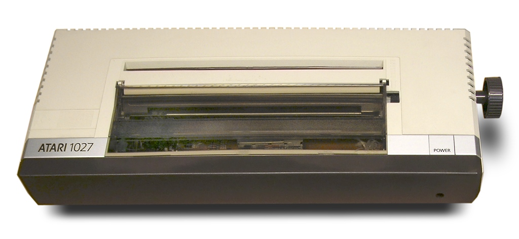
Daisy-wheel printers in particular, and their type-wheels, seem like they'd be a natural item for collectors to go after, but my Googling didn't locate any sites dedicated to them. Are they such a pain to repair and restore that no-one bothers with 'em? I've considered on more than one occasion getting a hold of an Atari 1027 (to match my 800XL), but the word on the web is that the print-wheels are all sorta falling apart, and spares are nonexistent. And maybe that's the whole problem. Computers, with their minimum of moving parts, usually don't need much beyond a good cleaning to be restored (unless we're going back more than three decades, in which case things get more complicated in inverse proportion to computing speeds of the day). Printers, like cars, need spare parts, and if the part isn't available, which is almost a certainty for anything that either was not intended for the enterprise market or is more than three years old, then that means you've got to fabricate it yourself. That's a serious investment of time for an item that, unlike a car, you probably wouldn't consider a thing of beauty. And the utility of a working, outdated, printer is pretty minimal as well. Although the utility of a working Commodore PET is pretty minimal, too, so that clearly isn't a high priority for the collector-types.
So this got me daydreaming about designing a large-format printer (very large) that was robust, easily serviceable, and built, like an old car, to be functionally useful for as long as someone's willing to change the oil. The trouble with printers is that they do everything on such a small scale that human hands are useless in the repair of their printing parts; even on printers with lousy printing resolution. Who's going to fix a pin on a dot-matrix printer's head? Nobody outside of Santa's workshop, for sure. So what about a printer that prints at, say, 4dpi? One quarter-inch for the smallest printing part seems entirely within the realm of human handiwork, doesn't it? And the ink-feed or ribbon or whatever mechanism was employed for carrying pigment would be large enough that you wouldn't need to worry about special, high-priced inks. You could use... anything. House paint, India ink, mud. Whatever.
Sure, you wouldn't use it to print your resume (at 4dpi, a black-and-white screen-capture of my desktop would be 29 feet wide), but for large prints on cloth for outdoor display, you might have something. Or big gallery prints of low-res computer artwork: Mega Man, in his original NES appearance, would print under eight inches across, and an entire Mega Man screen would be a modest 5-foot-4.
---
Writing this blog resulted in me writing a quick ActionScript project that simulated the creation of variously-sized canvases at various slow printing speeds (complete with ticky-tick noises). This turned into a gradient printing program, which then resulted in me reading about random number generators on Wikipedia.
Oh, tangential thought; how I love thee.
I remember playing Flashback on my Genesis when it came out and thinking "god, it can't get any better than this, can it?" The animation was smooth as silk, the backgrounds were lush and alive (the limitations of a 64-color palette are much more evident in emulation on a nice monitor; on a cheap 13" TV, things sorta blended together to the game's benefit). And the cut-scenes were much more fully-animated than the usual fare of the day (very flat-looking, so they were probably RLE compressed -- I say that with the benefit of present knowledge; when I was a kid it was just mind-blowing how they fit all that on a cartridge). It was all pretty exciting for my twelve-year-old brain. Still is, actually.
I'm trying to keep my current project under 32 colors per screen, but not for any great reason. It seems like an interesting limitation to work with, so I'm working with it, and luckily, so far, it's not proving to be much a of hindrance.
I was looking through some old magazines today and got to thinking about the printers I was seeing in the pages. All those poor, forgotten bits of engineering, condemned to be landfill, with no collectors, no users-groups, no restoration efforts. Printers, more than any other computer peripheral, are hardly missed once their service life has ended and they've left the home or office for an extended stay on the junk-heap.
Daisy-wheel printers in particular, and their type-wheels, seem like they'd be a natural item for collectors to go after, but my Googling didn't locate any sites dedicated to them. Are they such a pain to repair and restore that no-one bothers with 'em? I've considered on more than one occasion getting a hold of an Atari 1027 (to match my 800XL), but the word on the web is that the print-wheels are all sorta falling apart, and spares are nonexistent. And maybe that's the whole problem. Computers, with their minimum of moving parts, usually don't need much beyond a good cleaning to be restored (unless we're going back more than three decades, in which case things get more complicated in inverse proportion to computing speeds of the day). Printers, like cars, need spare parts, and if the part isn't available, which is almost a certainty for anything that either was not intended for the enterprise market or is more than three years old, then that means you've got to fabricate it yourself. That's a serious investment of time for an item that, unlike a car, you probably wouldn't consider a thing of beauty. And the utility of a working, outdated, printer is pretty minimal as well. Although the utility of a working Commodore PET is pretty minimal, too, so that clearly isn't a high priority for the collector-types.
So this got me daydreaming about designing a large-format printer (very large) that was robust, easily serviceable, and built, like an old car, to be functionally useful for as long as someone's willing to change the oil. The trouble with printers is that they do everything on such a small scale that human hands are useless in the repair of their printing parts; even on printers with lousy printing resolution. Who's going to fix a pin on a dot-matrix printer's head? Nobody outside of Santa's workshop, for sure. So what about a printer that prints at, say, 4dpi? One quarter-inch for the smallest printing part seems entirely within the realm of human handiwork, doesn't it? And the ink-feed or ribbon or whatever mechanism was employed for carrying pigment would be large enough that you wouldn't need to worry about special, high-priced inks. You could use... anything. House paint, India ink, mud. Whatever.
Sure, you wouldn't use it to print your resume (at 4dpi, a black-and-white screen-capture of my desktop would be 29 feet wide), but for large prints on cloth for outdoor display, you might have something. Or big gallery prints of low-res computer artwork: Mega Man, in his original NES appearance, would print under eight inches across, and an entire Mega Man screen would be a modest 5-foot-4.
---
Writing this blog resulted in me writing a quick ActionScript project that simulated the creation of variously-sized canvases at various slow printing speeds (complete with ticky-tick noises). This turned into a gradient printing program, which then resulted in me reading about random number generators on Wikipedia.
Oh, tangential thought; how I love thee.
9AJ
Sent off preliminaries of a lo-fi commission to the client. I shan't push another pixel until I hear back that I'm going the proper direction. My email, coming from my registered domain (which spammers just love to use in the return-address field of their garbage) will probably be delivered directly to the client's junk mail folder. He's been notified through other channels.
Downloaded ATASM and started reading the docs. I'm remembering how much I've forgotten about Atari/6502 programming. Why am I beating that old horse again? Well, the thread about Last Word 3.0 is on the front page of the AtariAge 8-Bit forums again. Normally I wouldn't care much, but I was looking through a book at the library today which gave me swells of nostalgia for composing text on the 8-bit (more on this below) so I thought I'd take another crack at it. Yes, I've tried Last Word in the past and thought it was a novel idea -- an 80-column word processor for the Atari 8-bit -- but it didn't exactly ripen my tomatoes for the sole fact that the text is profoundly hard to read on my Commodore 1702 -- three-pixel-wide glyphs are really pushing things a bit (it would be fine on a monochrome monitor, I have no doubt, but the shadow-mask on the Commodore is a little coarse, and hoses-up fine detail like text).
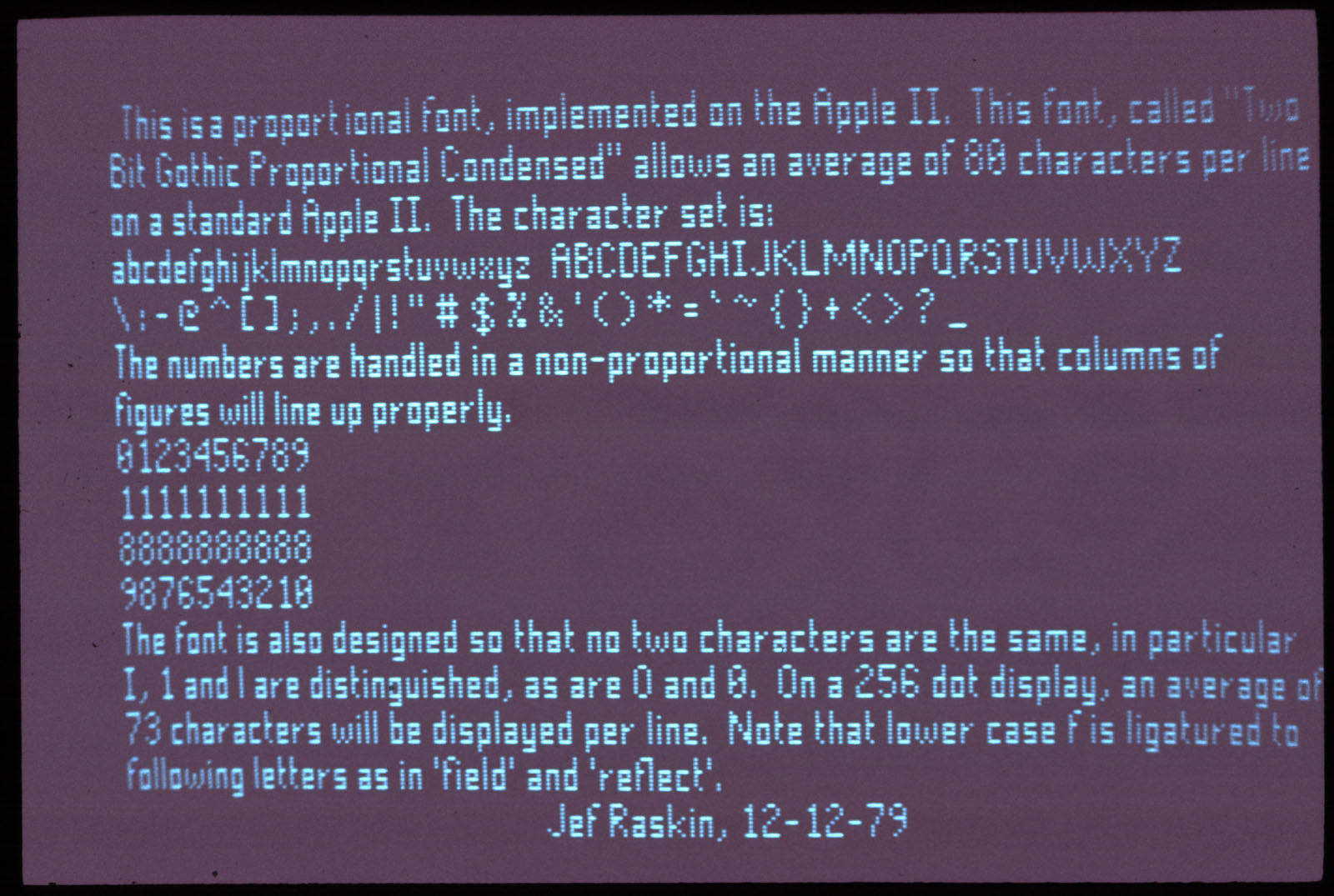
This caused me to remember a picture I'd seen of a Jef Raskin using a variable-width font on an Apple II which yielded between 70 and 80 characters per line and I thought "well, if Jef Raskin was doing it, it must have been user-friendly". I re-located the picture and took a look at the font ("Two Bit Gothic Proportional Condensed", for the curious). Better, but still a lot of 3-pixel glyphs. So I opened up Paint, set my image size to 320x192, and started clicking together a variable-width font with most of the glyphs being 4-pixels wide. Yeah, radical innovation, I know. What I came up with looks like it'll average around 60-70 characters per line on the Atari's 320-pixel-wide display ...if only there were a text-editor to use it with.
Hence my looking into ATASM. An auto-wrapping variable-width text editor might be relatively easy to implement in BASIC but even TurboBASIC would be way too slow to handle the screen re-drawing (which will have to be done in Gr.8+16 mode -- I'd use up all the Atari's RAM making character-sets which contained every possible combination of the glyphs if I went the same clever Gr.0 route that Last Word does). Anyway, spent some time today thinking on that. We'll see where it goes.
At its creators' request, nominated Goodbye Blue Monday for the WCRCA in the New Comic category, and it got me thinkin', "gosh, Me. You should really get back on that webcomic thing. You're not doing anything better with your time, are you?" To which I replied "if I got back on half the things I should get back on, I'd be doing inverted splits".
Visual metaphor. Work it out.
Couldn't sleep. Started a blog. I wouldn't be surprised if this was the only post ever made to it.
Oh, and back to that swelling of nostalgia: it strikes me as slightly stupid that I should be filled with nostalgia towards computers that I NEVER USED*. The aforementioned book was a volume of photographs of science fiction writers, circa 1982, and a few of them were photographed with/near their computers. By far the most impressive was Jerry Pournelle, who was seated in front of a couple of DEC cabinets (I could have sworn it said DECsystem/25, but I don't think that's a valid model) with what looked like a Televideo terminal perched atop one of them. While that photo gave me a swell of geek lust, it was instead a picture of a female author with whom I was not familiar, sitting in front of her Osborne-1, with its tiny 5-inch screen filled with tales-in-the-making, that gave me the nostalgic fever. And I ask you: what the hell for? I've never used an Osborne. I don't recall ever seeing one in person. For Pete's sake, I've never even used CP/M (well, sorta -- there was that one time that Nick was showing me his dad's KayPro, but that was for ten minutes). And I get that feeling whenever I see vintage hardware, particularly consumer-level hardware (I don't get nostalgia for mainframes, I just have a running loop of "WOW, neat-O ...WOW, neat-O ..." in my brain). And it's got a weirdly acute edge to it -- I see an old 8-bit in a forty-pound case with a keyboard the size of a wooden tree-swing's seat, with action only a caveman could love and a shitty monochrome display and I feel like -- get this -- I feel like I just want to... type on it. A lot. Pages, reams, volumes; just me and the micro in a small room, its excited phosphors beaming into my eyes and my fingers flying away, clunk-clunk-clunk, as the screen fills with god-knows what manner of gobbledygook. That vision plays back in my mind and I'm thinking "ah, the good ol' days..."
Good ol' days that I never lived. Fucking strange.
Downloaded ATASM and started reading the docs. I'm remembering how much I've forgotten about Atari/6502 programming. Why am I beating that old horse again? Well, the thread about Last Word 3.0 is on the front page of the AtariAge 8-Bit forums again. Normally I wouldn't care much, but I was looking through a book at the library today which gave me swells of nostalgia for composing text on the 8-bit (more on this below) so I thought I'd take another crack at it. Yes, I've tried Last Word in the past and thought it was a novel idea -- an 80-column word processor for the Atari 8-bit -- but it didn't exactly ripen my tomatoes for the sole fact that the text is profoundly hard to read on my Commodore 1702 -- three-pixel-wide glyphs are really pushing things a bit (it would be fine on a monochrome monitor, I have no doubt, but the shadow-mask on the Commodore is a little coarse, and hoses-up fine detail like text).
This caused me to remember a picture I'd seen of a Jef Raskin using a variable-width font on an Apple II which yielded between 70 and 80 characters per line and I thought "well, if Jef Raskin was doing it, it must have been user-friendly". I re-located the picture and took a look at the font ("Two Bit Gothic Proportional Condensed", for the curious). Better, but still a lot of 3-pixel glyphs. So I opened up Paint, set my image size to 320x192, and started clicking together a variable-width font with most of the glyphs being 4-pixels wide. Yeah, radical innovation, I know. What I came up with looks like it'll average around 60-70 characters per line on the Atari's 320-pixel-wide display ...if only there were a text-editor to use it with.
Hence my looking into ATASM. An auto-wrapping variable-width text editor might be relatively easy to implement in BASIC but even TurboBASIC would be way too slow to handle the screen re-drawing (which will have to be done in Gr.8+16 mode -- I'd use up all the Atari's RAM making character-sets which contained every possible combination of the glyphs if I went the same clever Gr.0 route that Last Word does). Anyway, spent some time today thinking on that. We'll see where it goes.
At its creators' request, nominated Goodbye Blue Monday for the WCRCA in the New Comic category, and it got me thinkin', "gosh, Me. You should really get back on that webcomic thing. You're not doing anything better with your time, are you?" To which I replied "if I got back on half the things I should get back on, I'd be doing inverted splits".
Visual metaphor. Work it out.
Couldn't sleep. Started a blog. I wouldn't be surprised if this was the only post ever made to it.
Oh, and back to that swelling of nostalgia: it strikes me as slightly stupid that I should be filled with nostalgia towards computers that I NEVER USED*. The aforementioned book was a volume of photographs of science fiction writers, circa 1982, and a few of them were photographed with/near their computers. By far the most impressive was Jerry Pournelle, who was seated in front of a couple of DEC cabinets (I could have sworn it said DECsystem/25, but I don't think that's a valid model) with what looked like a Televideo terminal perched atop one of them. While that photo gave me a swell of geek lust, it was instead a picture of a female author with whom I was not familiar, sitting in front of her Osborne-1, with its tiny 5-inch screen filled with tales-in-the-making, that gave me the nostalgic fever. And I ask you: what the hell for? I've never used an Osborne. I don't recall ever seeing one in person. For Pete's sake, I've never even used CP/M (well, sorta -- there was that one time that Nick was showing me his dad's KayPro, but that was for ten minutes). And I get that feeling whenever I see vintage hardware, particularly consumer-level hardware (I don't get nostalgia for mainframes, I just have a running loop of "WOW, neat-O ...WOW, neat-O ..." in my brain). And it's got a weirdly acute edge to it -- I see an old 8-bit in a forty-pound case with a keyboard the size of a wooden tree-swing's seat, with action only a caveman could love and a shitty monochrome display and I feel like -- get this -- I feel like I just want to... type on it. A lot. Pages, reams, volumes; just me and the micro in a small room, its excited phosphors beaming into my eyes and my fingers flying away, clunk-clunk-clunk, as the screen fills with god-knows what manner of gobbledygook. That vision plays back in my mind and I'm thinking "ah, the good ol' days..."
Good ol' days that I never lived. Fucking strange.
Subscribe to:
Posts (Atom)